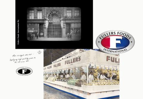
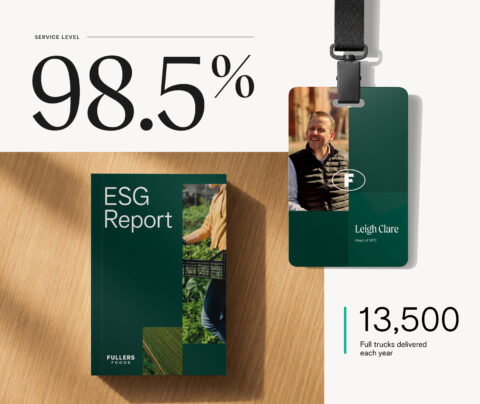

Fullers Foods has fed the country since 1876. In December 2022 the fourth generation of the family sold to its own management team in a private equity-backed buyout, and the business moved fast: turnover up 30% to £533m, a new leadership team, £3.5m into a food innovation centre on the Calls, new offices on Brewery Wharf. The brand was the last thing still describing the old company. The retailers and foodservice operators Fullers supplies had no way of seeing any of it.
Rebrand the business for the company it had become. Fullers had done strategy work two years earlier and it hadn’t brought anyone together. The job was to find the truths in the business that the first round hadn’t surfaced.
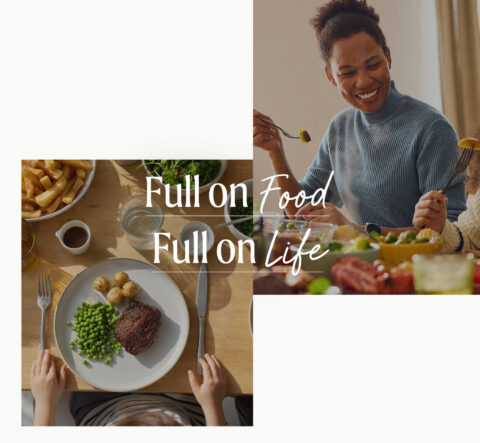
Full on Food. Full on Life.
They were a food business that wasn’t speaking about food.
Fullers is an own-label business, more than 1,200 products on supermarket shelves under Asda’s name, Tesco’s name, M&S’s name. A century and a half of putting food on tables across Britain under everybody’s name but its own.
The strategy Fullers already had described the company accurately and never once mentioned the thing everybody inside it cared about. Sit with the leadership team for an hour and you get people who are there because of food, and because of the people they feed. Nothing Fullers published said so. The company described itself the way the whole category describes itself: reliability, scale, accreditation, supply chain. A strong, distinct ideology, buried under years of borrowed language.
That gap was the opportunity. B2B food supply has trained itself out of talking about food. Every competitor sells the mechanics of moving it. Nobody sells the thing itself, or the relationships that carry it. For a 150-year-old business with a new HQ and the ambition to match, food was the one asset in the category sitting there unclaimed.
Two truths came out of the workshop; Fullers is obsessed with food, Fullers runs on relationships. We captured a Soul from these ideas:
Full on Food. Full on Life.
Food is the product and the obsession. Life is the people either side of it, the growers, the teams, the millions who eat what Fullers moves. Held together, they gave the business one idea to run everything through, from a photograph to the opening of a manufacturing site.
Every part of the system puts food back where it belongs, then puts people beside it.
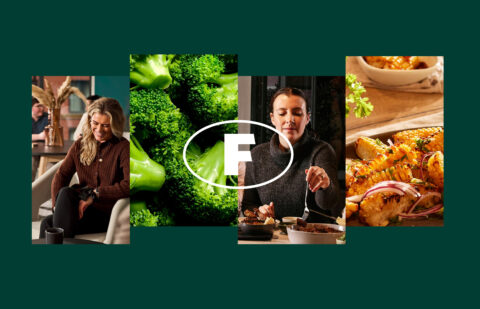
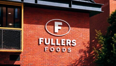
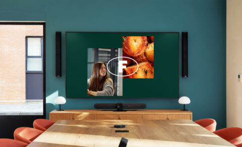
Full on Food. The roundel was on the chopping block when we arrived, and it stayed. Reworked as a transparent, integrated symbol, it now weaves through macro food photography instead of sitting on top of it: the mark inside the food, which is where Fullers sits in the supply chain. Large, it works as an aperture onto the product. Small, it holds the recognition the industry already had.
The palette is grounded in deep greens, teals and warm neutrals. Freshness and authenticity, and none of the corporate blue the rest of the category defaults to.
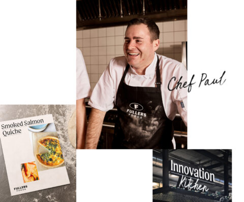
Full on Life. Typography draws on Leeds’ market roots, carrying the hand of product signage and the texture of blackboards. It brings the life of the trading floor into the boardroom and it gives a national supplier a local accent.
Side by side runs as a structural principle; food and life sit alongside each other in the motion built into the logo, and again in the grid: layouts for reports, presentations and visual communications hold the two in balance on the page, so the idea restates itself every time somebody opens a deck.
The voice was rewritten for clarity. Fullers now says what it delivers and who it delivers for, plainly, without the accreditation language the category leans on to sound serious.
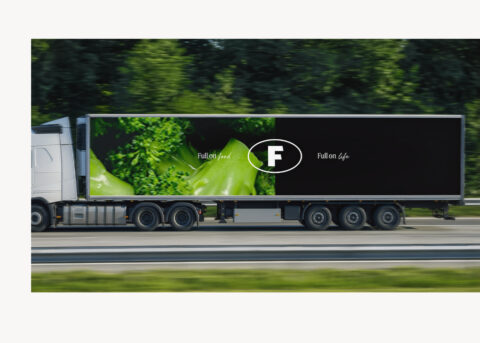
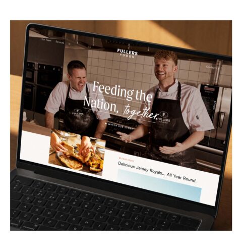
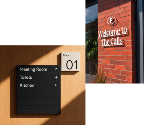
The identity runs across digital, print, signage, packaging and internal communications as one system. It is how the business introduces itself at a new manufacturing site and how it talks to a buyer, which is a harder test than a logo sheet.
Two years without alignment, three weeks to land. A brand strategy Fullers had already commissioned never brought the business together. Three weeks after starting with Kiss, the leadership team had one idea they could all work to and repeat from memory.
One brand, applied end to end. The identity runs across digital, print, signage, packaging and internal communications as a single system, with no local variants and nothing left on the old template.
Belief inside the business. Leadership’s response to the work was that it was a brand that finally feels like us. The rebrand gave a 150-year-old business a way of introducing itself that its own people recognised.
The relationship extended. Fullers came back to KISS for further brand work as the group grew.